Sunday, April 28, 2013
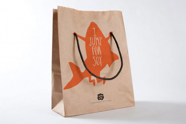
Yume Ume Bag

Kelly Dorsey has designed a simple and effective bag for Yume Ume, a sushi chain. Utilizing the excellent pun (I jump for soy) and using the handles in an out of the box way, it creates a bag design that will have you looking twice at it as it lays on your kitchen counter. The added arms and legs to the fish help with the jumping illusion, and it's as if the fish is saying it himself, like "put some soy sauce on me sir!" I really love this design and the fun idea.

Yupo Synthetic Paper Magazine Ad

While flipping through an issue of CMYK, I ran across this ad. With the ripped fellow challenging me to rip a simple page in a magazine, I was inclined to give it a try (and to possibly face the wrath of the librarians.) And I'll be damned if that isn't some of the toughest paper I've laid hands on, and the ad has a profound effect on the consumer. You've been challenged to do something that could damage the brand's reputation (durability) and when you aren't able to rip it, you want to look at the fine print and find out more about this company that just handed you your butt. It's like one of those salesman at the kiosks of the mall, except it's not annoying and what they're selling fits in a magazine and actually works.

Wednesday, April 24, 2013

In Like Flint by Bob Peak

Bob Peak is an artist well known for his art in James Bond posters and for really accentuating the 60s design aesthetic in his work. Bright gaudy colors and perfect hair. Suits and go-go boots. The 60s style was fun and psychedelic, using detail for the main characters of design and assigning shades of unnatural color to the people in the background; they are accessories to the main focuses of the piece. I love how the hair of what appears to be the main villainess is grasping for Flint, yet also creates arrows pointing towards him, showing that he is the target of the attacks.

DIE GERMS DIE

This Dial Complete anti-bacterial sanitation ad highlights the power of the hand purifier. THIS THING KILLS GERMS. THE POWER OF THIS STUFF MAKES THEM CRY, AND THAT'S WHAT YOU FEEL ON YOUR HANDS WHEN YOU USE THIS.
It's not subtle, and that's what makes it efective. The design is incredibly simple, with the drop of hand purifier also symbolizing the germ tears, and highlighting the purity of the products by how see through it is.  And the crying aspects of the text are larger font then the rest.

Good ol' fashioned MERICA

Americana is making a comeback, now when it's needed more than ever. We've been told we aren't number one anymore, and all the evidence of this is becoming more and more widely accepted. It's actually frowned upon by some to be even remotely patriotic. But you know what? This ad campaign is telling you to love it or leave it, and regarding that attitude, I love it. It's the classic world according to America, where our country is highlighted and everything else falls into the background as "those other countries to go to." The victorious handyman raising a USA made duct tape roll is propaganda-ish in a good way. Propaganda art is some of my favorite. It's not unsure or subtle; it's stone-faced, loud and sure. The slogan is not only a call to action on how to use the duct tape, but also a call for America. "Repair. Restore. Reinforce." I'm not even very patriotic and I want to wrap myself in an American flag  and watch some John Wayne movies.

Breaking the news in the best way possible

THIS AD CAMPAIGN KICKS VARIOUS AMOUNTS OF BUTT.
But really, I'm a big fan of these ads. I've only got once posted here, but feel free to check out the others, which range from "you've been audited" to "you knocked me up." These ads showcase the cake making skills of this bakery (I mean, just look at how readable "divorce" is! That's skill.) and how even bad news can taste delicious. No matter what message you want to send, we'll make it to the best of our abilities to deliver the bad news in the most delicious possible way. It's total irony, really. Also the tropes of cakedom that are parodies in these ads cracks me up to. The husband and wife on top of every wedding cake known to man being seperated like that catches the attention and draws the eyes down to the text/icing. I've got a sweet tooth for stuff like this.

Firestarter- good use of a circle aesthetic.

Firestarter is a fictional design firm created by Renee Dunn. this design is another good example of simplicity being the key to a good design. Sometimes with an idea like fire, it's very easy to go overboard and adding as many elements of fire as you can, and then before you know it, you have a design that is cluttered and has too much going on in it. This isn't the case with this design.
Using the x conveys the ideas that they could either be firewood or matches without being too explicit as to what it is. My only gripe is that the flame isn't dynamic enough, but I enjoy it a lot nonetheless. Something I've noticed with logos and design aesthetics is the use of the circle and if the area in the circle is equally distributed by the elements within, it's effective and pleasing to the eye.

Monday, April 22, 2013

Farm to City Logo by Nina Reck

This is another design by Nina Reck that I enjoy, so I decded to share it as well. The logo brings to mind a chalkish/ spraypaintish feeling from how the chicken and the bird are drawn, and if you're more farm-minded it looks like chalk, and if you're more city-minded it looks like spray paint, so the choice to have that texture was a smart one. The logo itself is great for bottles, with just a rooster and pigeon it can easily become iconic. Perhaps the most obvious design element is the fact that a chicken comes from a farm and a pigeon from a city, but I decided to address that lastly, due to the obviousness.

CPR Awareness

These CPR Awareness posters designed by Nina Reck are meant to show when CPR awareness would come in handy and how important it is to know CPR. The whole ad campaign takes place in different areas of isolation, and then shows the appropriate people in those locations in the same spot, the middle of the page, practicing CPR. The simple designs of the people and their surroundings allows for this to be an effective ad campaign, so if people see it more than once, they can equate it with the last one they saw, and the two colors, tints of white and red, bring to mind the red cross or hospice-like feelings, reinforcing the life saving technique being portrayed.

El Luchador Tequila: Harnessing the power of Mexican Cheesiness

El Luchador Tequila designed by Katey Mangels, uses the design aesthetic of cheap posters for luchador matches and uses them to it's advantage. The two colors that don't work two well; the floating heads of the luchadores, and the uneven pasting on of the label helps to reinforce the design choice of bringing to mind a cheap tequila authentically made in Mexico. And in this way the design excels.

Factory Fishing: using two elements from larger ideas

This poster, created by the design tag team of Joe Scorsone and Alice Drueding, is a great poster and gets it's slant across that factory fishing is evil and harmful to the ocean, destroying all life within. The top of the poster looks like a normal boat with a mast and the seagulls circling around it, but then the bottom part of the poster, encompassed in the blue, makes the boat look like a monster, with red eyes and sharp teeth. The poster shows the diversity of the sea life being sucked into the mouth, and leaving behind an empty ocean devoid of life.
The design would not have been as effective if it wasn't for the funneling feeling evoked by the grouping of the ocean life. It really emphasizes the emptiness of the ocean after factory fishing, reinforcing the slant of the creation.
The elements of the normalcy of the boat and the tropes we have of what monsters look like are combined in this design to create the final "machine."