Ahhhhh summer. Flip flops. Barbecues. Sprinklers. Ice cream. Tank tops. Heat. Music Festivals.
Unsurprisingly, summer is the season of choice for almost every single music festival. The weather is great to drive up those water prices, and it's least likely to rain, snow, sleet, hail, or any other type of precipitation other than humidity that could ruin everything.
Logos for these music festivals tend to reflect the mood of these festivals: exciting, stress-free, and full of creative energy.
Bonnaroo, arguably the most popular music festival in the united states, reimagines it's logo every year. The "oo"s in the logo represent a sideways infinity and they even added a partial circle above it to represent a cd/ perhaps another infinity symbol. I loved the colors they used in the 2011 design as well, representing the sweltering heat with the orange to yellow, the farmland with the negative spaced grass and the discovery of new music and adventures, with the two person shapes walking through the "n". All these reasons make the 2011 logo my favorite of all the years.
Firefly is a relatively new festival in Delaware, but their identity is rock solid. The rustic look of the font and the jar design creates as nostalgic feeling, and the name and idea behind the logo gives rise to those happy feelings of being a kid again, and worrying only about how many fireflies you can catch by the end of the night. The colors, deep green and light green, are tranquil and calming. Even though it's a music festival, and it'll be sure to be exciting, the colors and logo make it inviting and calming.
Wednesday, February 27, 2013
Sunday, February 17, 2013
The designer you can blame for "it's a small world"
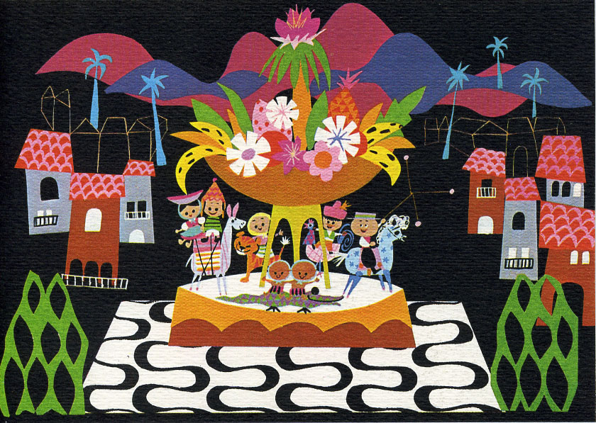
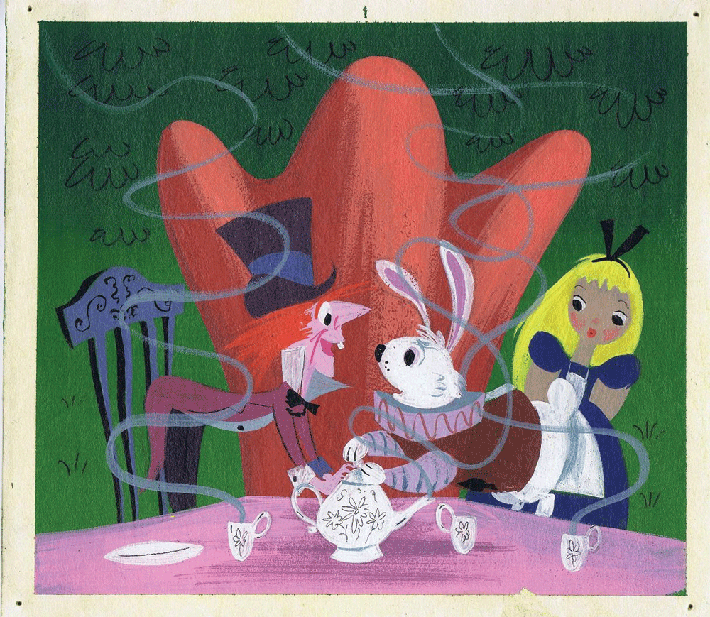
Mary Blair. Her name may not mean much to most people, but any Disney Nerd knows her name and her work. She was a concept artist for the Walt Disney Company, designing the colors and moods for many disney films in the 50s and 60s , and creating murals for parks and hotels, and everyone's least favorite ride "It's a Small World."
Look at their sick sadistic smiles
Her designs/artwork is deceptively simple. She used simple shapes but arranged them in such a way that entire landscapes can be seen in charming, mood creating ways. For instance, the colors for small world create an idea of happiness; that the world is bright and full of life and friendship and somewhat stereotypical nationalities.
But it's adorable, so it's ok.
And when she created moods for scenes in the animated features, she was asked to give the key animators an idea how the scene should fear, and then they would reference her painting for the color palette.
From her pre-production designs and color schemes, animators were able express the mood of a scene as well as they could.
Monday, February 11, 2013
Old Logos vs. New Logos
There comes a time in a brand's life where it'll have to change it's identity. Much like how a senior in high school can change as a freshman in college, if a brand lives long enough and feels the need to be relevant again or needs to reach a new audience, it'll change it's appearances/logo.
Sometimes the change will be flawless. The logo only gets better over time. Over the years they've looked at what worked, what didn't work, and made the best possible logo taking all that into consideration. Consider the Chargers logo for example:
This was the first San Diego Chargers Logo. Not to pretty huh?
Seriously, this was one busy logo. Some sort of dragon/horse/griffin/whatever above a lightning bolt within a shield. The new Chargers logo is much cleaner, better to look at, and it looks much more nifty on a helmet.
(The only thing they did this season was CHARGE into mediocrity) nyuk nyuk nyuk
They got down to the nitty gritty with this one. It's a simple logo, and it's really all that the chargers needed to be in the first place. No griffin/dragon looking monster thing and hokey looking font. Just a nice lightening bolt perfectly shaped for a helmet.
Other logos can go the other way with age, almost like a mid-life crisis.
I'm looking at you, Mr. Ford.
I'm also looking at you, Arby's.
I'm not an Arby's fan, but their logo worked for what it was. Simple cowboy hat and a font that works with the hat. Everything works together nicely. It's nothing awesome, but it's unoffensive. Then they had to do this.
Why is the hat at an angle view? Why is the font not? Why use a meat cutter as the apostrophe if you won't even go anywhere with that idea in the rest of the logo?
This mess seems life they wanted to in 3 directions at once, and failed in all of those directions. The simple non-capitalized type doesn't work with the unsimple, garish hat, and apostrophe could've been salvaged if they got rid of the hat altogether. The deeper shade of red isn't as inviting either. It's almost too blood red.
I guess what I've learned writing this post is that, well if something doesn't work, change it, but make sure the change is better and effectively represents your brand better than what came before, or takes it in a new and brighter direction and future. And if something does work, leave it for the new changes, because that's what we liked in the first place.
If it isn't broke, well, you can still fix it up a little bit.
Tuesday, February 5, 2013
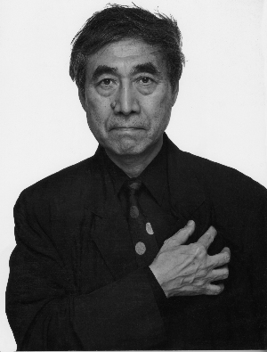
Shigeo Fukuda: what a guy
Pictured above: Bro
So I guess I'll get this blog started off by talking about my favorite graphic artist, Shigeo Fukuda. This guy's awesome!
I discovered Mr. Fukuda when doing a project for my earlier design class. We had to write brief bios about 50 or so designers/design techniques, with 5 of them being our own choices. I made a few google searches for the top designers in the world and his name came up more than a couple times, so I googled him and I discovered the wonderful simplicity and complexity of Shigeo.
He was not a graphic designer as much as he was a graphic ARTIST. Much of his work was not advertisements for products, but advertisements for peace.
Perhaps his most impact-full piece is "Victory 1945." A bullet flying into the barrel of a gun; a statement on the absurdity of war. The only real victory can come about when the bullets are left in the barrels.
This is one of my favorite designs due to the sheer simplicity of the design itself but the statement speaks volumes.
So I guess I'll get this blog started off by talking about my favorite graphic artist, Shigeo Fukuda. This guy's awesome!
I discovered Mr. Fukuda when doing a project for my earlier design class. We had to write brief bios about 50 or so designers/design techniques, with 5 of them being our own choices. I made a few google searches for the top designers in the world and his name came up more than a couple times, so I googled him and I discovered the wonderful simplicity and complexity of Shigeo.
He was not a graphic designer as much as he was a graphic ARTIST. Much of his work was not advertisements for products, but advertisements for peace.
This is one of my favorite designs due to the sheer simplicity of the design itself but the statement speaks volumes.
Subscribe to:
Posts (Atom)


