Monday, March 18, 2013
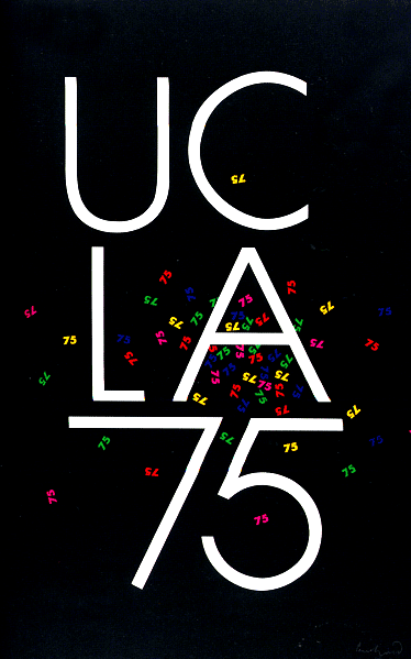
Paul Rand UCLA
America Calling

Herbert Matter, the designer of this Civilian defense poster, creates a great sense of motion and he shows good use of color. the blue and red diagonal lines to the top back and bottom of the bald eagle gives you the feeling of swooping down on an enemy or prey(in this case the Nazis since this poster was designed during world war 2). Keeping the bald eagle black and white helps to avoid the color of brown and white clashing with the red and blue. White being the main color of the poster also helps for America to be the top in the hierarchy of attention, leaping out of the wing of the eagle. The text is also slanted like the stripes to increase the sense of motion as well.
The NYC subway system: a triumph in taking the complex and making it simple
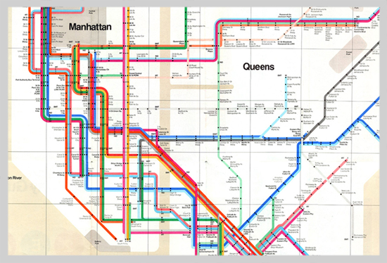
Navigating the subway system of the big apple is a daunting tast, but thanks to it's color coding system, the task is a little bit less terrifying. Graphic Designer Massimo Vignelli is the creator of the map for the NYC subway system and DC's Metro system, which are two of the more easily confusing metro systems in the nation. Before these maps were invented, you'd have look at signs at stations to see if the direction you are heading is right or to see which colored line you're currently on, and all this information would be scattered on walls or on the screens of the train. Now all commuters need to do is look at this one map and they'll know which way to head and what train to get on without having to look around to multiple sources as much. The idea of making the lines different colorsthat aren't so similar helps the traveler greatly so confusion can be kept to a minimum, and the clear background with the black type helps to increase readability.
Guitar Hero Typography
Michael Bierut also designed the famous guitar hero logo. Using a font type based on the type of font used predominately in heavy metal, his typography is able to capture the style and flair of the Guitar Hero franchise.

Michael's font is uneven and highly stylized yet readable and memorable. Notice how the bottoms of the letters in guitar go with the tops of the letters in hero. The bottoms and tops contour together in a way that is pleasing to look at. The letters also get smaller as they go further into the word, with the g and r in guitar being larger than u i and a, but the t is kept large to keep the text centered. The same is occuring within the hero, with but with h and o being smaller and e and r being a bit larger.
Michael's font is uneven and highly stylized yet readable and memorable. Notice how the bottoms of the letters in guitar go with the tops of the letters in hero. The bottoms and tops contour together in a way that is pleasing to look at. The letters also get smaller as they go further into the word, with the g and r in guitar being larger than u i and a, but the t is kept large to keep the text centered. The same is occuring within the hero, with but with h and o being smaller and e and r being a bit larger.
Sunday, March 17, 2013
Effective use of negative space...like a sex machine
Real talk: James Brown was the man. The godfather of soul deserves a well designed poster in honor of his funkiness, and I think this poster certainly takes the cake.


Using lyrics from his songs, this poster creates an action portrait of the one and only James Brown. The funky font lends itself to the feeling the poster tries to evoke, and it helps create a natural look on James' face, so much so that if you squint it looks like his face minus the words. It goes with the contours of the cheeks, lips and nose very well. The lyrics that are going around James' face are spaced in such a way with the background color to create James Brown's hair with the negative space. This poster helps to create a foreground image of James Brown singing with a background of energy all through the use of fonts and effective spacing of the font.
IDA Logo
Pentagram, the world famous design firm in New York that produces some of the greatest graphics, includes Michael Bierut, a senior critic in graphic design at the Yale School of Art, and the national president of the American institute of Graphic Art. He was put in charge of creating the logo for the IDA (international design alliance) congress, which seeks to realize the benefits of design in a variety of fields. The logo goes off the idea of Pangaea, which is the theory that earth once had one large land mass that eventually drifted further apart from one another to the earth that we know today.

The Logo Michael created for the congress has more than one meaning like most good logos. It can be seen as both an ink blot, but at a longer glance it can be seen to be Pangaea, with all the countries banded together into one landmass. What makes this logo so effective is the use of black and white, allowing the logo to be as readable as possible and it can be used in any medium flawlessly. The two meanings that can be taken from it and the complex simplicity (the details of the countries in relation to the simple idea) makes it a work of genius.
What's Wrong with this Picture?

Wow. There's alot going on in this picture, and not much of it is good. The only thing that is working is the grey around the black and red square, but everything goes wrong in the center. The image seems to not be created on the computer but was taken by a camera due to the light created on the right side of the image. It doesn't make sense why he/she didn't simply make the rest of the background black/grey. The font and the effect on the the font don't fit with anything else on the page AT ALL. Blue and yellow are the last colors that compliment black and red, and the way they are layered onto the black and red makes it hard to read. the reflection doesn't make any sense either, since neither design nor strategies are on the same plane.
Saul Bass and the bell
Saul Bass also tried his hand in designing the new logo for AT&T. The company was in dire need of an update, because the current logo was so dull and official, and in the 60s they were definitely looking too old fashioned.
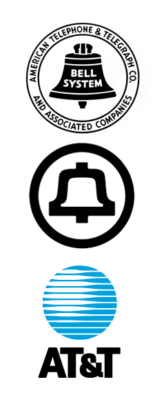
Bass' redesign greatly streamlined the logo and got rid of any text. It's a good example of keeping the old elements of a logo and updating it to keep it relevant. Logos like the old AT&T were probably more acceptable in the 50s, but it wouldn't have worked well in the 60s with the new styles developing.
After Bell went under and At&t was left, Bass designed the new infamous at&t logo, which I personally hate. It's looks like a blue death star, and it hurts the eyes just looking at the closeness of the lines. At&t later polished up this death star logo into what they call the marble. They got rid of the multiple lines down to about five and curved the lighter parts of the lines to make it more eye friendly.
Saul Bass: the other great poster designer
Before the movie poster was revolutionized in the 70s, the only way to advertise a movie was to show screeenshots and publicity shots of the stars. They were very bland in nature and didn't look aesthetically pleasing, but that's where Saul Bass comes in. Saul is best known for his collaborations with Alfred Hitchcock anin designing the opening title sequences for many of his films including "north by Northwest," "psycho," and "anatomy of a murder." By using abstract concepts and making them larger than life, he was able to creat memorable title sequences that were fun and interesting to watch and drew viewers into the stories. His posters were mainly red and white in color, to get an audiences blood pumping and get them excited about the film. The posters would also not directly show what to expect in the movie, but rather an impression of the elements involved in the film, like the swirling multiple circles for the Vertigo poster, which can represent the main characters medical condition and the narrative as a whole.


Helvetica
Helvetica is the font most used by designers, but why is that?
 Created in 1957, Helvetica has been popular ever since. It's popularity could be due to the fact it's one of the most readable fonts available. It's type is the simplist, yet still complimentary of each other (the i and j for example). The font works well regardless of kerning and still remains readable, and it can be used on nearly anything for any subject matter. It's a chameleon of fonts: with no intrinsic meaning or fanciful flourishes within the font, it can become whatever it needs to be for different projects/ads/etc. It's a font you could use on anything and 9 times out of 10 will looks great and undistracting and complimentary.

Susan Kare
Behind the interface of the Apple products of the 1980s, there's Susan Kare. Kare started work at Apple Computers in 1982, and she worked on the interface, graphics, and fonts for these early Apple computers, laying the ground work for what Apple Computers would eventually become.

Most of Kare's icons are still being used today by Apple Computers thanks to their simplicity and ability to let the user know what the icon does. Icons for the interface of an OS are incredibly important since that is what the user will be using, and to make sure it's user friendly, icons must be readable and readily be able to explain what they do as concisely as possible, and Kare's icons were able to do that.
 She also invented multiple typefaces for use by Apple, most notably the Geneva typeface (used for the first 4 generations of Ipods.) It's a simple sans serif
that is effective in its readability.
She also invented multiple typefaces for use by Apple, most notably the Geneva typeface (used for the first 4 generations of Ipods.) It's a simple sans serif
that is effective in its readability.
Most of Kare's icons are still being used today by Apple Computers thanks to their simplicity and ability to let the user know what the icon does. Icons for the interface of an OS are incredibly important since that is what the user will be using, and to make sure it's user friendly, icons must be readable and readily be able to explain what they do as concisely as possible, and Kare's icons were able to do that.

Drew Struzan

Alphonse Mucha- the Father of Art Nouveau
Alphonse Mucha was born in 1860, and it wasn't until his 30s around 1890 did the design aesthetic he helped create, Art Nouveau, took the art world by storm. Mucha got his first big break that brought him recognition in 1894, when he entered a print shop in the need for a new advertising poster for the most famous actress in Paris. Alphonse said he could produce one in two weeks time, and after creating it, it sparked his career as a poster designer and a creator of a new art form and aesthetic.

The poster that was created by Mucha for "Gismonda"
After gaining a ton of publicity for his work on the "Gismonda" poster, Mucha went to work, creating loads of artwork, ads, posters, and illustrations, and in doing so inspired many others to imitate his work. His fame as an advertising artist frustrated him. He believed that art should have a spiritual message, which seemed to be the opposite intention in terms of advertising.
After passing away in 1939, his work would have a rollercoaster ride of interest, with little or none in the 40s and 50s and shooting up in the 60s and 70s, inspiring artists and designers of the time as well.
Art Nouveau- art and design
Art Nouveau is a nearly forgotten art form that I wish would make a comeback. Popular in 1890-1910, Art Nouveau seeked to mold the old and new; nature and man together, and to present intricately and pleasingly to the eye. Art Nouveau not only sweeped the art world by storm in the early 20th century, but it also made it's way into advertising and design aesthetics.
 This poster advertising beer was created by Alphonse Mucha, who's considered the father of Art Nouveau. This image shows all the normalcies within the Art Nouveau discipline. A serene woman looking contemplative; nature is usually worked into the artwork, and in this one it's a floral arrangement in her hair and trees behind her. The clothing is very similar to what ancient Greeks or Romans would've worn: loose fitting and comfortable. Even the font has a distinct feel to it: rounded and natural. Art Nouveau pieces have a calming effect few other artforms possess, which is useful in advertising if you'd like your audience to connect your product to feeling good.

Wednesday, March 13, 2013
University of California Logo.....terrible?
The new logo doesn't look horrendously, offensively bad, but as a logo for a school it doesn't really instill a sense of pride per se. I get what they were going for too. The U is the large blue area behind the off-putting C shaped gradient, and it also doubles as an open book (check out the top of it, it's actually pretty neat). The C is where something went wrong, and I can see why people would be offended having this as the official seal of a school. The gradient just doesn't look right, and looks sloppy. It would;ve been much more effective if it was left just as a normal yellow C minus the gradient, and maybe even permissible, but this is the one huge glaring flaw of the new logo, and it sold the taste of the rest of it.
Something that could've worked better for the new logo would've been to take elements from the old and polish them or make them break out of the tropey feel of the seal. Like a star above the book shape of the U, and keeping the scroll of Let the be Light, or even adding that saying somewhere into the new one....I mean really, don't scrap every little thing from an old logo unless the old one made people hate it.
Monday, March 11, 2013
The Orioles: a circle of life
Logo redesigns certainly aren't uncommon. Brands are always trying to change their identity, to move their brand into the future and stay relevant. A curious case of this is the Baltimore Orioles franchise. They went from simple, to cartoon, to realistic, to cartoon again, in a kind of circle to fix tarnished image and to harken back to the old days in the 70s, when the Orioles were a dominant franchise in the MLB.
 The logo strarted as a simple oriole bird, looking close to a drawing done by a 5-year old. Then 1966 rolled around, and the major change to a smiling cartoon oriole with a baseball cap seemed to breath life into the team, considering the 60s and 70s were the heyday of the team. Interestingly enough, some of the worst years in the franchises history was when they opted for the realistic logos from 1989 to 2012. It's hard for me to even call these logos. They're more like life-like drawings you'd find in bird spotting manuals, and they don't do a very good job helping the brand identity or giving a feel to the team. It's hard to get excited about a team that has a field guide on it's cap.
The revamp was major and part of what seems to be a country wide return to the retro. We love nostalgia, because it helps us to remember the best times in life, and this logo helps do that. It takes us back to the days the Orioles were dominant, and the change in orange helps to get people more excited about the team. The deeper orange is more intense, rather than the lighter and more cheerful orange from the previous logos, and it gives the Orioles a more competitive spirit. There's also the O on the Orioles cap, reinforcing another logo of the O's, and advertising it's own brand within a brand.
The revamp was major and part of what seems to be a country wide return to the retro. We love nostalgia, because it helps us to remember the best times in life, and this logo helps do that. It takes us back to the days the Orioles were dominant, and the change in orange helps to get people more excited about the team. The deeper orange is more intense, rather than the lighter and more cheerful orange from the previous logos, and it gives the Orioles a more competitive spirit. There's also the O on the Orioles cap, reinforcing another logo of the O's, and advertising it's own brand within a brand.
Thursday, March 7, 2013
The Citi Logo
The Citi logo, one of my favorite logos, has an interesting history to it. The interesting thing about it is how long it took to think up. Not very long at all.
It was sketched on a Napkin during a lunch break, and that very same napkin was displayed to the Citi group clients who had come to Pentagram (the firm I mentioned in my last post) for the new logo. Citi group and Travelers had just partnered and they needed a new logo to reflect the partnership.


It was sketched on a Napkin during a lunch break, and that very same napkin was displayed to the Citi group clients who had come to Pentagram (the firm I mentioned in my last post) for the new logo. Citi group and Travelers had just partnered and they needed a new logo to reflect the partnership.
picured: the art of Paula Scher
At first the new logo was met with some resistance, considering the presentation was less than usual. But after Pentagram displayed the new logo in a more professional form, the clients were satisfied.
The logo may appear simple, but there's more to it. Citi group was originally just a font based logo, and Travelers was literal; an umbrella. By combining those two logos, the new Citi logo was born. Notice the red arch above the T, and how the lowercase t appears to be the handle of an umbrella. The red arch was taken from the Travelers logo. The simplicity gives way to deeper meanings. An umbrella can represent protection, and the blue stands for stability; the red for passion.
Eddie Opara & the UCLA logo
Eddie Opara is a newer designer, making splashes in the design community when he was partnering with Pentagram, one of the most prestigious design firms in the U.S. their work includes the Citi Logo, billboard magazine, and the Sundance film festival (I'll be talking about the Citi logo in a later blog, as it's one of my favorites.) Eddie Opara was chosen to join Pentagram due to his great ability to take two elements you never thought could work together and make something wonderful out of it.
The UCLA Architecture and Urban Design logo is the perfect case of this. When looking at the logo, it seems to be a group of shapes, but it becomes both an Architectural structure and the letters of the school spelled out all in one fell swoop. It's actually quite dynamic.
 Upon first glance it's simply a group of squares withing squares, but after reading the text and looking at it again to make sense of it, the letters appear. Personally I find this to be genius! The simple colors of black and white help to drive the point home.
The UCLA Architecture and Urban Design logo is the perfect case of this. When looking at the logo, it seems to be a group of shapes, but it becomes both an Architectural structure and the letters of the school spelled out all in one fell swoop. It's actually quite dynamic.
Monday, March 4, 2013
Favorite Logos part 3

I really like this logo thanks to it's 30's style, classy font, And it's edges of gold, which remind me of a logo you'd see on a movie star or studio's gates back in the day. I'm confused as to why Disney decided to include Mickey in this logo. He isn't even dressed as a Director. He's just there.
The final logo for the last of the Disney Parks evokes a feeling of discovery and naturalism, which is what Animal Kingdom is all about. It's the most overlooked of all 4 and also the least visited due to it's lack of attractions, but it's perhaps the most well themed, with every bit of the park telling stories of conservation, the beauty of the natural world and it's inhabitants, and what we can do to help the, survive.
Favorite Logos Part 2
I felt like I needed to split up the Disney Logo post due to the amount of Disney world logos. The four parks each have their own goals and how they want to immerse you in a fantastical setting and help you forget your worries, and the logos are similar in their attempts...except for the main Walt Disney World logo, which is the most boring thing I've ever seen.
 Take the Walt handwriting, slap some Times New Roman behind it and boom. This is the logo that represents the World's most visited attraction. I can understand their need to be neutral, seeing as it'd be tough to include the distinct personalities of the parks into one logo but c'mon. The older Walt Disney World logo is much more interesting to the eye, and it includes a globe with mouse ears. There ya go. That's way more visually stimulating than a simple font, and it says more about the resort than a default font.
 The Magic Kingdom park which is the most iconic of all 4, uses the same font as Disneyland as I mentioned before, to emphasize the fantastical settings.
 The second most iconic park is Epcot. You know, the one with the giant golf ball. Epcot is nearly the opposite of magic kingdom. Epcot tries to show you the real world in new and innovative perspectives, from traveling throughhistory, to flying over the beautiful views of California, to walking around the world (a pretty stereotyped world mind you). Epcot's logo includes and image into it's typographical set up of a ring revolving around a globe. It creates the illusion of movement around earth, which can be used to reinforce the idea that Epcot is all about using our best technology and our resources to make a better planet, and to keep earth revolving around the sun.

Favorite logos part 1
Now, I may be a little biased since I've worked with this company for the past two years, and their films are some of my favorites, and damn it I love me some Dole Whip! The Walt Disney pictures logo and all other Disney logos are some of my favorites.
Even before Walt passed away (or was frozen and stored under Matterhorn bobsleds), their logo had been a simple seal of quality. It consisted of Walt's signature and a revolving technicolor profile of his finest creation, Mickey Mouse. It was meant to showcase both the main figure of the company and the technological advances being used in their products.

Perhaps their most famous logo was introduced in 1995 with the simple layered castle with the arch above it. This logo still contains Walt's signature, but it is much cleaner and easier to read, while still retaining his characteristic handwriting. The castle that was added is a reference to not only the films disney produces, but also one of it's other products: the theme parks. This logo helped to make Disney synonymous with great home entertainment and theme park fun. Who didn't want to go to a Disney park after watching a Disney movie?
 Speaking of Disney parks, both of the two properties in the U.S. have their own unique logos. Like most Disney logos, they're mostly typographical, but both the logos evoke different feeling.

the disneyland logo, created for the original park in Anaheim, CA, evokes a feeling of fantasy and royalty. It's font seems Royal Germanic, and makes you feel like it is a kingdom of sorts, like a Magic Kingdom. The Magic Kingdom park in Walt Disney World also uses the same font due to the similar feeling it wishes to have on it's guests.
Even before Walt passed away (or was frozen and stored under Matterhorn bobsleds), their logo had been a simple seal of quality. It consisted of Walt's signature and a revolving technicolor profile of his finest creation, Mickey Mouse. It was meant to showcase both the main figure of the company and the technological advances being used in their products.
Perhaps their most famous logo was introduced in 1995 with the simple layered castle with the arch above it. This logo still contains Walt's signature, but it is much cleaner and easier to read, while still retaining his characteristic handwriting. The castle that was added is a reference to not only the films disney produces, but also one of it's other products: the theme parks. This logo helped to make Disney synonymous with great home entertainment and theme park fun. Who didn't want to go to a Disney park after watching a Disney movie?
the disneyland logo, created for the original park in Anaheim, CA, evokes a feeling of fantasy and royalty. It's font seems Royal Germanic, and makes you feel like it is a kingdom of sorts, like a Magic Kingdom. The Magic Kingdom park in Walt Disney World also uses the same font due to the similar feeling it wishes to have on it's guests.
Subscribe to:
Posts (Atom)