
Wednesday, May 8, 2013
BattleStar Galactica font
The Star Trek Font

The Star Trek Logo
The larger, yellow symbol is pointed upwards, and creates a feeling of upward mobility and speed, since the point of starfleet is to boldly go where no man has gone before, and to explore and make connections with alien races. Not only is the logo about literally going upwards into space, but also bringing humanity and universe as a whole up through connectivity and helping each other.
Inside this symbol is a star with an elongated top point, which also takes the upwards motion idea.
The star wars font

The Shining
In honor of Saul Bass' birthday, I decided to revisit his work and take a look at a poster that I love for 1980's The Shining. It's interesting how different this poster looks compared to today's horror movie posters, which almost entirely use red and black in their design schemes but the minimalism has continued. I actually like the choice of the color yellow, since it catches the eye more than red, and since yellow is most of the poster it makes you feel energized creates nervous energy.
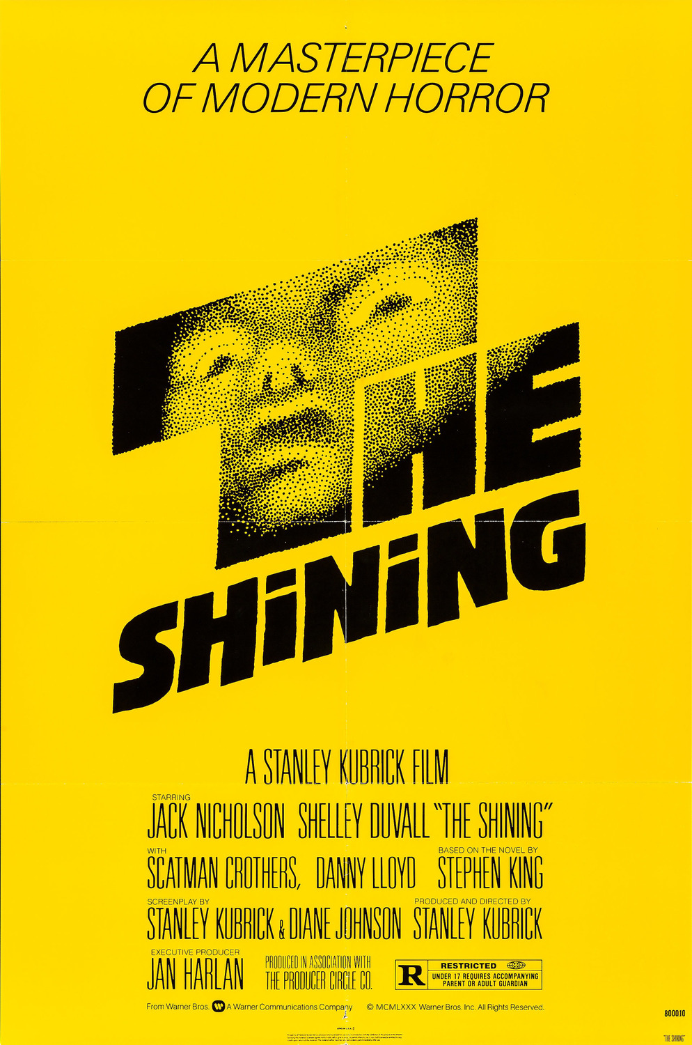 The face that appears to come out of the darkness of the letters is haunting, and it suggests that the words are more of a window into a dark place than just words. The slanting of the letters also suggest that something isn't quite right.
Adiddas originals
I'm also a big fan of the adidas originals logos, that are a branch of adidas shoes that are reminiscent of the designs of shoes in the 60s and 70s.


The logo also uses the 3 stripes motif, but it's quite a bit different.

The logo creates a leaf using 3 ovals and it contains the 3 stripes running through it. With simplicity and an evenly parallel design, the logo is not just a leaf but a collection of 3's.
The Adidas logo
The brand with the 3 stripes. All day I dream about (insert something that begins with "s"). Adidas has long lived in the shadow of Nike, but it's always been my favorite sports show, partly because they treat their workers more fairly in the countries where they make the shoes, and also because I prefer the overall design of the shoes. They may not be the most flashy of shoes like Nikes, and they don't draw as much attention, but I like that. The simple use of 3 stripes is enough for someone to know which brand your shoe is. The logo for the adidas brand is reminiscent of the design on the shoe, with three stripes in ascending order.
 I really enjoy the movement of the design, and the simplicity that creates the movement.
Subscribe to:
Posts (Atom)