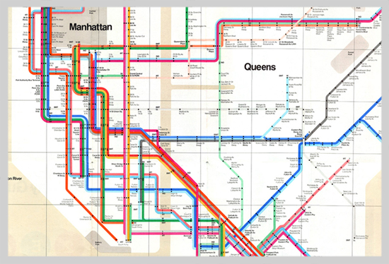
Navigating the subway system of the big apple is a daunting tast, but thanks to it's color coding system, the task is a little bit less terrifying. Graphic Designer Massimo Vignelli is the creator of the map for the NYC subway system and DC's Metro system, which are two of the more easily confusing metro systems in the nation. Before these maps were invented, you'd have look at signs at stations to see if the direction you are heading is right or to see which colored line you're currently on, and all this information would be scattered on walls or on the screens of the train. Now all commuters need to do is look at this one map and they'll know which way to head and what train to get on without having to look around to multiple sources as much. The idea of making the lines different colorsthat aren't so similar helps the traveler greatly so confusion can be kept to a minimum, and the clear background with the black type helps to increase readability.
No comments:
Post a Comment