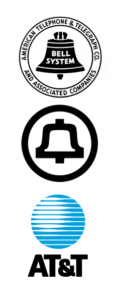
Bass' redesign greatly streamlined the logo and got rid of any text. It's a good example of keeping the old elements of a logo and updating it to keep it relevant. Logos like the old AT&T were probably more acceptable in the 50s, but it wouldn't have worked well in the 60s with the new styles developing.
After Bell went under and At&t was left, Bass designed the new infamous at&t logo, which I personally hate. It's looks like a blue death star, and it hurts the eyes just looking at the closeness of the lines. At&t later polished up this death star logo into what they call the marble. They got rid of the multiple lines down to about five and curved the lighter parts of the lines to make it more eye friendly.
No comments:
Post a Comment