Wednesday, May 8, 2013
The Shining
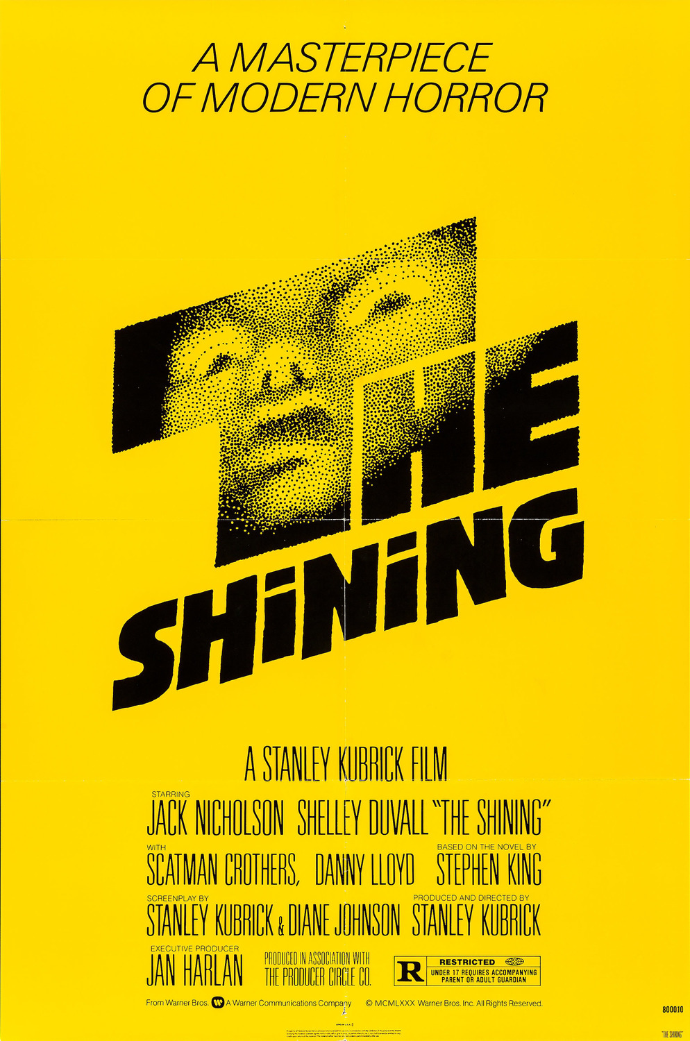
In honor of Saul Bass' birthday, I decided to revisit his work and take a look at a poster that I love for 1980's The Shining. It's interesting how different this poster looks compared to today's horror movie posters, which almost entirely use red and black in their design schemes but the minimalism has continued. I actually like the choice of the color yellow, since it catches the eye more than red, and since yellow is most of the poster it makes you feel energized creates nervous energy.
The face that appears to come out of the darkness of the letters is haunting, and it suggests that the words are more of a window into a dark place than just words. The slanting of the letters also suggest that something isn't quite right.
Subscribe to:
Post Comments (Atom)
No comments:
Post a Comment