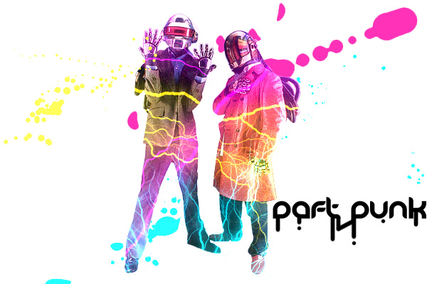
Daft Punk are my favorite DJ's. They've got the style, the sound, and freaking robot heads. It's a really cool look that gets my creative juices a'flowin. Their style demands a more refined and "classy" design aesthetic. This is not that kind of a design.
It reminds me of an ad for an 18+ club paint party advertisement, using neon tinted colors and electricity for some odd reason. The font is also a detriment, going along with the paint party look with a dripping looking design. The splatter also looks odd in the background, as though they weren't custom made but rather downloaded and made larger, giving the pink one an awkward clipped look. Overall this is not a great way to represent Daft Punk. This makes them look more like an LMFAO kind of group.
No comments:
Post a Comment