Monday, March 18, 2013
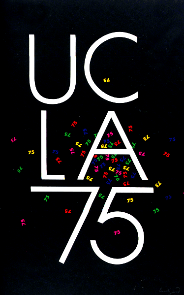
Paul Rand UCLA

America Calling

Herbert Matter, the designer of this Civilian defense poster, creates a great sense of motion and he shows good use of color. the blue and red diagonal lines to the top back and bottom of the bald eagle gives you the feeling of swooping down on an enemy or prey(in this case the Nazis since this poster was designed during world war 2). Keeping the bald eagle black and white helps to avoid the color of brown and white clashing with the red and blue. White being the main color of the poster also helps for America to be the top in the hierarchy of attention, leaping out of the wing of the eagle. The text is also slanted like the stripes to increase the sense of motion as well.
The NYC subway system: a triumph in taking the complex and making it simple
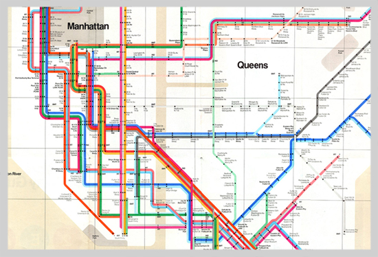
Navigating the subway system of the big apple is a daunting tast, but thanks to it's color coding system, the task is a little bit less terrifying. Graphic Designer Massimo Vignelli is the creator of the map for the NYC subway system and DC's Metro system, which are two of the more easily confusing metro systems in the nation. Before these maps were invented, you'd have look at signs at stations to see if the direction you are heading is right or to see which colored line you're currently on, and all this information would be scattered on walls or on the screens of the train. Now all commuters need to do is look at this one map and they'll know which way to head and what train to get on without having to look around to multiple sources as much. The idea of making the lines different colorsthat aren't so similar helps the traveler greatly so confusion can be kept to a minimum, and the clear background with the black type helps to increase readability.
Guitar Hero Typography
Michael Bierut also designed the famous guitar hero logo. Using a font type based on the type of font used predominately in heavy metal, his typography is able to capture the style and flair of the Guitar Hero franchise.

Michael's font is uneven and highly stylized yet readable and memorable. Notice how the bottoms of the letters in guitar go with the tops of the letters in hero. The bottoms and tops contour together in a way that is pleasing to look at. The letters also get smaller as they go further into the word, with the g and r in guitar being larger than u i and a, but the t is kept large to keep the text centered. The same is occuring within the hero, with but with h and o being smaller and e and r being a bit larger.

Michael's font is uneven and highly stylized yet readable and memorable. Notice how the bottoms of the letters in guitar go with the tops of the letters in hero. The bottoms and tops contour together in a way that is pleasing to look at. The letters also get smaller as they go further into the word, with the g and r in guitar being larger than u i and a, but the t is kept large to keep the text centered. The same is occuring within the hero, with but with h and o being smaller and e and r being a bit larger.
Sunday, March 17, 2013
Effective use of negative space...like a sex machine
Real talk: James Brown was the man. The godfather of soul deserves a well designed poster in honor of his funkiness, and I think this poster certainly takes the cake.


Using lyrics from his songs, this poster creates an action portrait of the one and only James Brown. The funky font lends itself to the feeling the poster tries to evoke, and it helps create a natural look on James' face, so much so that if you squint it looks like his face minus the words. It goes with the contours of the cheeks, lips and nose very well. The lyrics that are going around James' face are spaced in such a way with the background color to create James Brown's hair with the negative space. This poster helps to create a foreground image of James Brown singing with a background of energy all through the use of fonts and effective spacing of the font.
IDA Logo
Pentagram, the world famous design firm in New York that produces some of the greatest graphics, includes Michael Bierut, a senior critic in graphic design at the Yale School of Art, and the national president of the American institute of Graphic Art. He was put in charge of creating the logo for the IDA (international design alliance) congress, which seeks to realize the benefits of design in a variety of fields. The logo goes off the idea of Pangaea, which is the theory that earth once had one large land mass that eventually drifted further apart from one another to the earth that we know today.


The Logo Michael created for the congress has more than one meaning like most good logos. It can be seen as both an ink blot, but at a longer glance it can be seen to be Pangaea, with all the countries banded together into one landmass. What makes this logo so effective is the use of black and white, allowing the logo to be as readable as possible and it can be used in any medium flawlessly. The two meanings that can be taken from it and the complex simplicity (the details of the countries in relation to the simple idea) makes it a work of genius.
What's Wrong with this Picture?

Wow. There's alot going on in this picture, and not much of it is good. The only thing that is working is the grey around the black and red square, but everything goes wrong in the center. The image seems to not be created on the computer but was taken by a camera due to the light created on the right side of the image. It doesn't make sense why he/she didn't simply make the rest of the background black/grey. The font and the effect on the the font don't fit with anything else on the page AT ALL. Blue and yellow are the last colors that compliment black and red, and the way they are layered onto the black and red makes it hard to read. the reflection doesn't make any sense either, since neither design nor strategies are on the same plane.
Subscribe to:
Posts (Atom)