
Wednesday, May 8, 2013
The Adidas logo
The brand with the 3 stripes. All day I dream about (insert something that begins with "s"). Adidas has long lived in the shadow of Nike, but it's always been my favorite sports show, partly because they treat their workers more fairly in the countries where they make the shoes, and also because I prefer the overall design of the shoes. They may not be the most flashy of shoes like Nikes, and they don't draw as much attention, but I like that. The simple use of 3 stripes is enough for someone to know which brand your shoe is. The logo for the adidas brand is reminiscent of the design on the shoe, with three stripes in ascending order.
 I really enjoy the movement of the design, and the simplicity that creates the movement.

Monday, May 6, 2013
Daft Punk deserves better than this
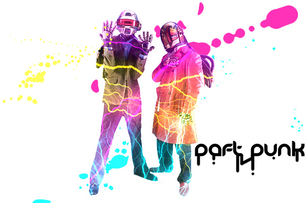
Daft Punk are my favorite DJ's. They've got the style, the sound, and freaking robot heads. It's a really cool look that gets my creative juices a'flowin. Their style demands a more refined and "classy" design aesthetic. This is not that kind of a design.
It reminds me of an ad for an 18+ club paint party advertisement, using neon tinted colors and electricity for some odd reason. The font is also a detriment, going along with the paint party look with a dripping looking design. The splatter also looks odd in the background, as though they weren't custom made but rather downloaded and made larger, giving the pink one an awkward clipped look. Overall this is not a great way to represent Daft Punk. This makes them look more like an LMFAO kind of group.
Eh-nstagram
I may be the first to say it, but I'm not a big fan of the Instragram logo. Most other social networking type sites or applications have an incredibly simple design. Facebook has the white F. Twitter has a bird, and heck even myspace was simple with 3 stick figure humans. Instagram is going to be that hipster social networking site by going against the grain and making a logo with way too much going on.


We get that the whole gist of the app is about picture taking. You don't have to put what you actually do in the logo, for god's sake. Twitter's logo isn't a girl complaining about the weather, or a giant hashtag. Facebook's logo isn't a "share this or this baby dies" post. Neither or they giant computer screens. I believe a more effective logo for instagram is just "Insta" and the colors over top of it. It's similar to the polaroid logo for those old cameras, since instagram is basically a 21st century global polaroid camera. It would stand out in the wall of apps on most people's ipods more than the current logo.
Wednesday, May 1, 2013
Hanshin Tigers


Much like this dodgers cap, the Hanshin Tigers cap logo consists of two letters intertwined to create an identity that's easily recognizable. While it's not the most creative of ideas...it doesn't really have to be. What better way to represent your city than with a baseball cap that contains the initials of the team or the city? Logos like these are well liked by many due to the accessibility of the branding and the easy recognizability. It may be bold, but I'd say I enjoy the Hanshin Tigers logo much more than I enjoy the Western baseball teams logos. The H and T are perfectly symmetrical, and the type of the letters is based off uniquely eastern design aesthetics. The H will remind some of the arching top of the Osaka Castle, or the curved blade of a samurai sword. The top of the T also looks like a bridge, which osaka has a couple of (represented by the two arches on the top of the T). The logo is deceptively simple yet you can take many meanings from it. And even if you aren't trying to find a deeper meaning, the symmetry and the classic baseball design is pleasing the see and to wear as you represent your team.
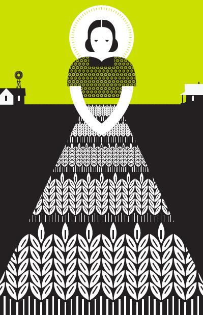
Kitchen Dog Theater poster by Rob Wilson
Austin Beerworks

Intuition ale works- creating unique identities for each kind of beer

Subscribe to:
Posts (Atom)